Making Coffee A Memorable Experience
June - August 2018

Tools Used
Secondary Research, Brand Assessment, Interviewing, Co-Design, Moodboards, Competitive Analysis
Role
Brand Designer | Brand Strategist
Context
Ever wanted specialty coffee to be approachable and warm? Cozy Trove is a homegrown brand that sells specialty coffee in Dubai. Cozy Trove needed a brand identity that would help develop its presence as an emerging Sri Lankan specialty coffee.
Solution
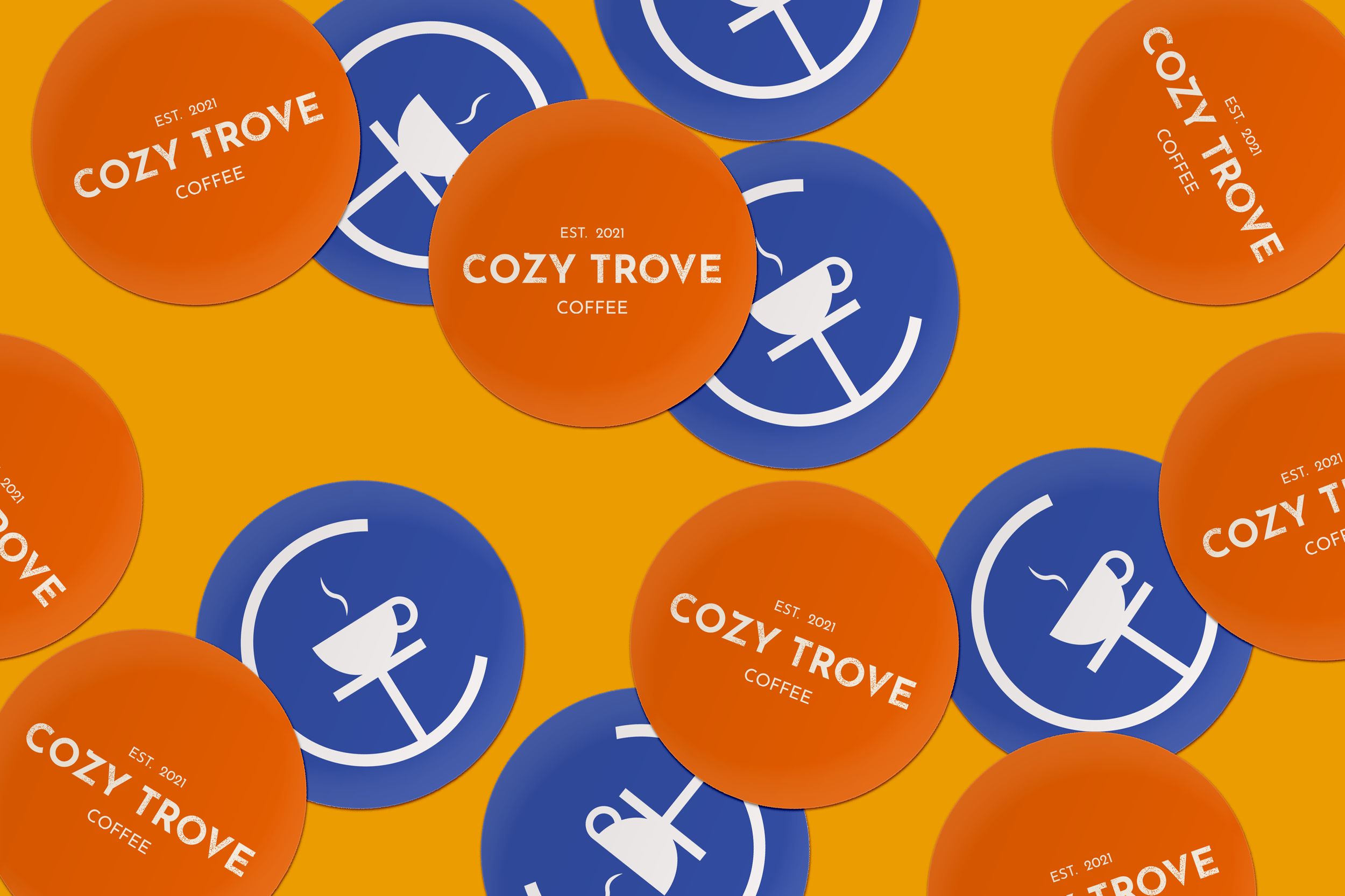
By understanding the goals of Cozy Trove and its target audience, a branding identity was created in which the client could have the freedom to create the packaging, social media content, merchandise etc. to establish its brand. The brand identity’s aim was to make specialty coffee approachable to newcomers, but also give a more vibrant appeal to coffee connoisseurs, by showing Sri Lanka’s colorful side.
Key Outcomes
23
page booklet on how to handle the brand, physically and digitally.
10+
ways on how to use the logo flexibly and responsively (digital + physical purposes)
8
colors with 4 patterns that can be used to communicate the brand’s vision
The Challenge
In Dubai, there is no specific coffee brand that highlights or focuses on Sri Lankan coffee, and there is a demand for it given the 150,000 Sri Lankans in Dubai, and the emerging market for coffee shops and local brands in the UAE.
Additionally, the brand needed to convey a sense of comfort, but also a feeling of refreshment, joy and vibrancy.
Discover
Interview & Research into Value Proposition
As a new brand, a Brand Situation Assessment was conducted to understand where Cozy Trove is coming from, who is its target audience, and what the brand wanted to aspire to be. The series of images below show how the client and I walked through key information before starting on the visual branding of the project. Like this, and at several points throughout the project, I also co-designed the service with the client to ensure that they had all the resources they needed to carry out their service.


What’s the scope?
Part of learning more about building the brand was learning what the client needed to use the branding for - both short and long term. We outlined all the possible needs she had for the short term. The idea was that, as a branding booklet should, it would provide her all the tools she would need to maintain consistency across different touch points of the service.
Define
What’s in a logo?
One thing the client stressed on was that they wanted to include Sri Lankan cultural elements or island vibes into their branding, as to make people realize and identify with the idea that Sri Lanka is also a place where coffee is grown and sold, while still making the brand look approachable and friendly. The first iteration shows various digital studies of logos explored before establishing color schemes, overall visual language and other elements necessary to build up the brand.


Develop
Moving forward, we chose a logo that took inspiration from the sesath; a symbol that at one point in time was functionally and ritually used to denote wealth and social standing. Now, it is hung up as decor in Sri Lankan homes for good fortune and luck. It was fitted to have a sun as part of the logo as well as it denoted the idea of warmth, while also alluding to the client's name.
Inspiration & Moodboard
With the client, we explored various brands in the market that use vibrancy, and elicited a sense of joy and comfort. We dove deeper into what “comfort” meant as part of the brand as well. A lot of the exploration into comfort was based on finding cultural elements in the branding and packaging design. We decided to build the visual language of the brand further by adding colours relevant to Sri Lanka as well as patterns and shapes that would enhance the overall brand and make it more joyous and approachable.


Deliver
Part of the outcome was creating a booklet that helped address and guide how to use the logo, and how to build the brand accordingly. It went into detail on what kind of photography was beneficial for the brand, as well as creating social media posts as well. Check out the slew of photos and slides for more information about the brand and how it’s been built.


Take a peak at the booklet!


Key Learnings
Design, business and culture go hand(s) in hand(s).
Understanding the relevance of a brand strategy and how to translate that into design is incredibly important. Moreover, learning how to collaborate with the client to build a brand according to their vision is crucial. It’s easy to want to create the whole brand and packaging as a designer, but it’s important to understand their needs and allow them to also have freedom with the brand.
Understanding both the business and design needs was also imperative, includes the cost of printing materials and how design can be affected by it.
Lastly, it was crucial to consider how to make the brand experience adaptable to digital and physical means.


