Introduction
A YouTube thumbnail is often the first visual viewers notice when browsing videos.
A clear thumbnail can help communicate the video’s topic and attract interested viewers.
Step 1: Understand Your Video Topic
Identify the main idea or benefit of your video.
The thumbnail should accurately represent the content.
Step 2: Use a Suitable Canvas Size
A 16:9 layout is standard for conventional YouTube video thumbnails.
Follow YouTube’s current upload and file-size requirements.
Step 3: Choose a Strong Main Subject
Use a recognizable object, person, or visual result.
Avoid filling the thumbnail with too many unrelated elements.
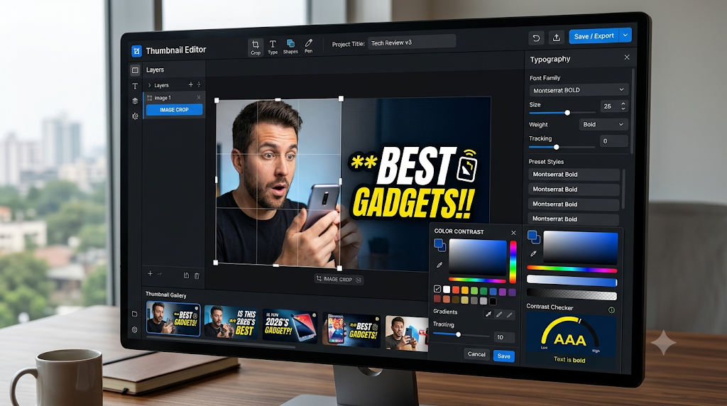
Step 4: Add Short, Readable Text
Use only a few words when text adds value.
Make sure the text remains readable on a small smartphone screen.
Step 5: Improve Contrast
Choose colors that separate the main subject from the background.
Step 6: Maintain Visual Consistency
Use recurring fonts, colors, and layouts when they support your channel identity.
Step 7: Compare Performance
Where available, use YouTube’s thumbnail testing features or review performance across comparable videos.
Avoid assuming that clicks alone determine a video’s success.
Conclusion
Effective YouTube thumbnails combine clear communication with attractive design. Focus on relevance, readability, and honest representation rather than misleading clickbait.