
Most visitors to small business websites now arrive on their phones. Mobile-first design means planning the website for small screens first and then enhancing it for larger ones. The result is a site that is faster, simpler and more effective at turning visitors into customers.
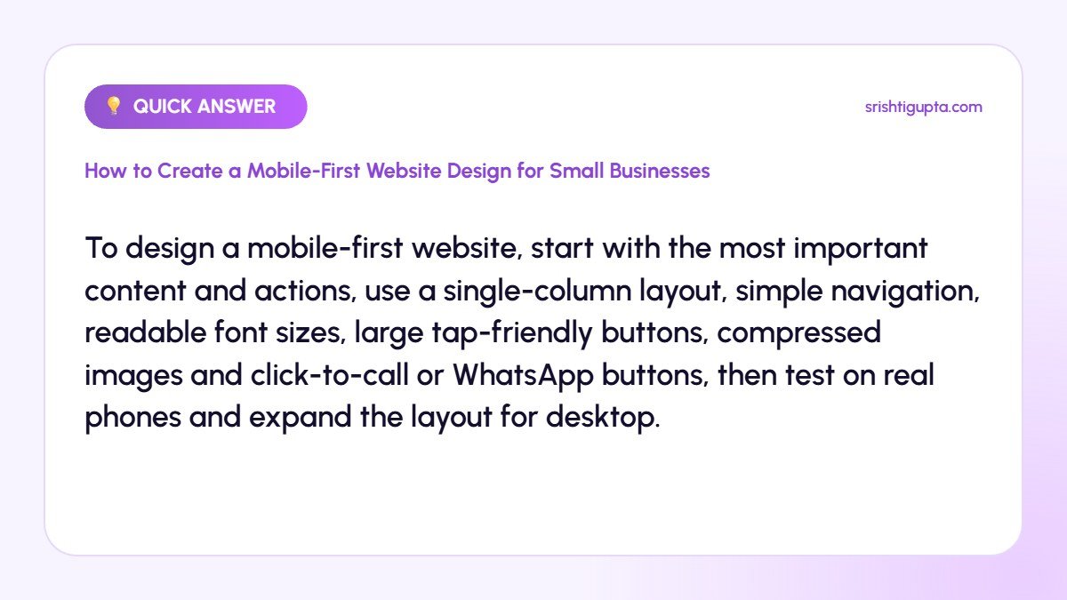
Quick answer: To design a mobile-first website, start with the most important content and actions, use a single-column layout, simple navigation, readable font sizes, large tap-friendly buttons, compressed images and click-to-call or WhatsApp buttons, then test on real phones and expand the layout for desktop.
Why It Matters
Google uses mobile-first indexing, which means it primarily evaluates the mobile version of your site. A poor mobile experience can hurt rankings and frustrates customers who want to call, find directions or enquire quickly.
Step-by-Step: How to Create a Mobile-First Website Design for Small Businesses
Step 1: Prioritise content and actions
List what mobile visitors need most, such as services, prices, location and contact. Place these at the top and remove anything that does not help.
Step 2: Use a simple single-column layout
Stack content vertically with clear sections. Avoid side-by-side elements that become cramped on small screens.
Step 3: Design simple navigation
Use a compact menu with a few key links and a visible call-to-action button. Make sure the hamburger menu is easy to open and close.
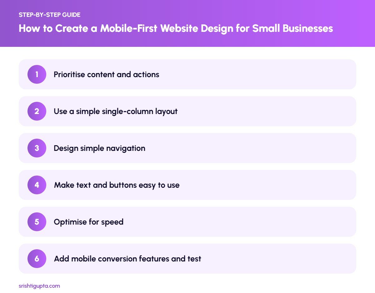
Step 4: Make text and buttons easy to use
Use body text of at least 16 pixels, good contrast and buttons large enough to tap comfortably, with enough spacing between links.
Step 5: Optimise for speed
Compress images, use modern formats, limit animations and reduce scripts. Fast loading on mobile data is critical for small businesses.
Step 6: Add mobile conversion features and test
Add click-to-call, WhatsApp and map links. Test the site on different phones and with Google Lighthouse, then expand the design for tablets and desktops.
Pro Tips
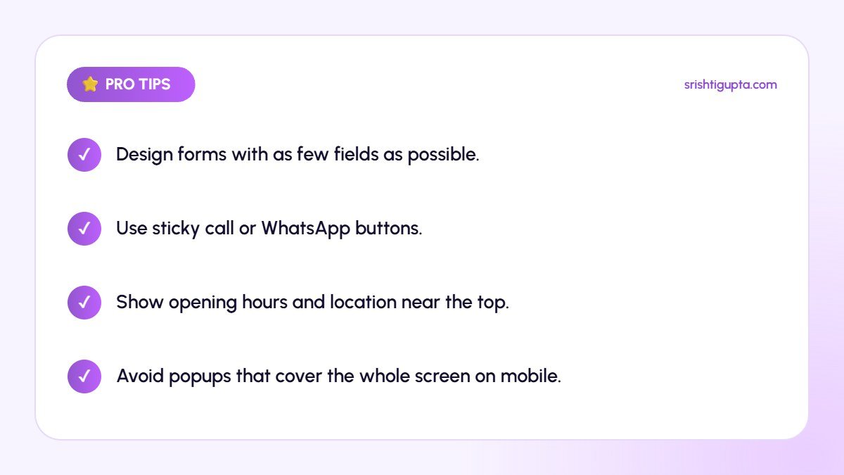
- Design forms with as few fields as possible.
- Use sticky call or WhatsApp buttons.
- Show opening hours and location near the top.
- Avoid popups that cover the whole screen on mobile.
Common Mistakes to Avoid
- Designing for desktop and shrinking it later.
- Using tiny text and buttons.
- Hiding important information inside sliders.
- Uploading large images that slow mobile loading.
Frequently Asked Questions
What is mobile-first design?
It is a design approach where you plan and build for small screens first, then enhance the layout for larger screens.
Does mobile-first design help SEO?
Yes. Google uses mobile-first indexing, so a fast, usable mobile site supports better visibility and user signals.
How do I test if my website is mobile-friendly?
Use Lighthouse in Chrome DevTools, PageSpeed Insights and real devices to check layout, speed and usability.
Final Thoughts
A mobile-first website meets customers where they are. Prioritise essential content, keep layouts simple and fast, and make it effortless for visitors to contact you from their phones.
Need expert help? Srishti Gupta is a digital marketing expert in Ludhiana. Explore her website development or get in touch to discuss your project.